")


Mobile Design: Crafting Seamless User Experiences for the Small Screen
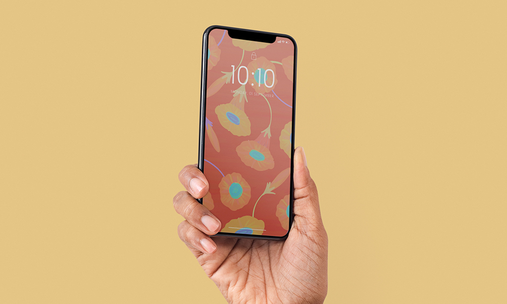
In a world where over 60% of web traffic comes from mobile devices, mobile design is no longer optional—it’s essential. Whether you’re building an app, launching a mobile-responsive website, or improving your digital presence, mobile design is at the heart of a successful user experience.
From speed to usability to aesthetics, mobile users demand fast, intuitive, and visually appealing digital experiences. In this comprehensive guide, we’ll explore what mobile design is, why it matters, and how to do it right.
Tools for Mobile Design
Figma – Real-time collaborative design and prototyping.
Adobe XD – Vector-based design tool with interactive prototyping.
Sketch – Mac-only design tool popular for mobile UI/UX.
InVision – Powerful for prototyping and user testing.
Zeplin – Helps bridge the gap between designers and developers.
Mobile Design Trends in 2025
Voice-Enabled UI
Dark Mode Optimization
Gesture-Based Navigation
Neumorphism and Minimalist UI
AI-Driven Personalization
Foldable and Dual-Screen Device Support
Investing in thoughtful, user-centric mobile design is one of the smartest decisions a brand can make in 2025. As users grow increasingly reliant on mobile devices, delivering intuitive and visually engaging experiences is not just good design—it’s good business.
Whether you’re building a mobile app or optimizing your website for smartphones, the principles of mobile design ensure you’re ready to meet users where they are: in the palm of their hands.

- Web Design
- PPC
- App Development
- Branding & Design
- System & Guide
- Digital Marketing
- Online Ads
- Ecommerce Ads
- Content Writing
- Content Management
What Is Mobile Design?
Mobile design refers to the process of creating user interfaces and experiences specifically optimized for smartphones and tablets. Unlike desktop design, mobile design prioritizes smaller screens, touch interactions, limited bandwidth, and on-the-go use cases.
Mobile design includes:
Responsive web design (adapting layouts to fit screen sizes)
Mobile-first design (designing for the smallest screen first)
Native mobile app design (designs for iOS and Android)
Progressive Web Apps (PWAs) and hybrid apps
At its core, mobile design aims to make digital experiences effortless, accessible, and enjoyable—regardless of where users are or what device they’re using.